I have never used the technique or scraping the painy to give the photograph a more artistic style. When applying the paint, I learnt that I had to be more confident to get a better, bolder outcome. I also used oil pastels as it was a quick and easy way to apply colour.
I added relevent magazine cut-outs to the photographs which worked really well. I added a picture of an armchair and a book table to the photograph of the fable. This gives the image a feeling of antiquity. Similar to this, I added a calm blue paint to the photograph of the Quran along with a butterfly cut-out. It symbolises peacefulness, harmony and the beauty of the butterfly flows alongside the beautiful structure of the text.
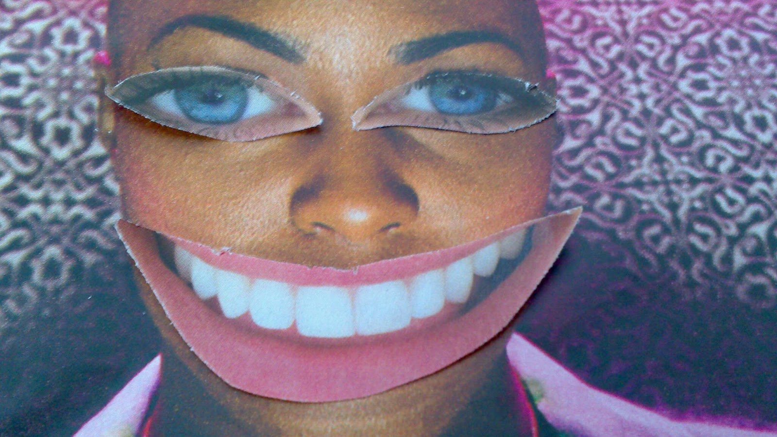
After experimenting on my photographs from the museum, I began to do the same on magazine cut-outs whilst altering them with paint. Although this may not link to my ideas from the museum, it allows me to experiment further. I also followed the collaging style of the artist, Robert Rauschenburg and portrait aspect of John Stezaker.


No comments:
Post a Comment