Thursday, 19 June 2014

Evaluation

EVALUATION

I have done things a lot of things differently this year. The leniency and lack of structure compared to A-Level was extremely difficult to get used to however it has taught me how to be more independent and creative. I have managed to focus on a great deal more experimental work as this opened a window of many opportunities for me.
My plan was to fit as much experimental work in as possible in order to gain a concrete idea. As well as this, I also focussed on acquiring influence off various artists from various spectrums of art. With the Foundation being a platform for gaining new skills, my first thought was to try 3D art. I needed something more than just my drawings for the exhibition. Leaving my comfort zone is something I needed to do. I experimented with Modroc, Plasticine, Modelling Clay and Fimo along with making my boxes from scratch. Although my boxes were successful, half of my 3D work was not. Proceeding to gain inspiration by further artists, I concluded that I could create a 3D/2D piece of work. This was a perfect idea for my exhibition piece, it is fun to look at, it complements my watercolours wonderfully and while it is still 3D art, it represents my love for illustration in an alternative way.
Whilst conducting the 3D experiments, I was also creating various watercolour paintings that were to illustrate the literature, this is what my boxes were interpreting. Logging the e-mails between the commissioner and I allowed me to collect feedback and criticism. This was useful as it gave me the insight on how another person can see something differently to how I see it. After investigating various ways to present both the commissioner’s poems and my illustrations, we came to a well-rounded conclusion.  I had to work around the layout of the text and this influenced the composition of my drawings however this isn’t as a negative thing.
My only fault with my illustrations is I believe I should of used my Ink Soluble Pencils as well as my watercolour palette, I believe this could have intensified the colours on my illustrations. I gained some final criticism off a girl called Hester who lives down my street who is 6 years of age. This age is perfect for the criticism I needed as young people are never shy to speak their mind and it is young people who I most strive to illustrate for.

I am happy with all of the work I have achieved and I am glad I have had disasters along the way as it is how I learn and progress. I am extremely pleased with my organisation skills during unit 7 as past experiences have taught me to keep up to date with everything at all times. This has helped massively and my only criticism and regret is that I didn’t leave a lot of time for myself to do some detailed drawings to show my varied skills. Overall I have matured a lot since A-Level, my time management and independence has improved massively and I am ready for university. 

Sunday, 15 June 2014

Bibliography

Anne Digby (1999) The Naughtiest Girl Helps a Friend, London: Hodder Children’s Books.

E.B White (1993) Charlotte’s Web, 3rd edition, London: Puffin Books.

Emma Dexter (2005) Vitamin D: New Perspectives in Drawing, London: Phandon Press Ltd.

Jacquelene Wilson (1993) The Suitcase Kid, Corgi Yearling edition, London: Random House Children’s Books.

Jan Dean (2003) Funny Poems, London: Scholastic Children’s Books.

Lemony Snicket (2001) A Series of Unfortunate Events: The Wide Window, London: Egmond Books Ltd.

Magnus Muhr (2010) The Life of Fly, Chichester: Summerside Publishers Ltd.

Paul Stewart (2007) Barnaby Grimes: Curse of the Nightwolf, London: Random House Children’s Books.

Paul Stewart (2007) The Edge Chronicles: The Twig Trilogy, Collected edition, London: Random House Children’s Books.

Roald Dahl (2009) George’s Marvellous Medicine, Edition produced for Nestle Cereal, London: Penguin Group

Terry Deary (2004) Horrible Histories: The Villainous Victorians, London: Scholastic Ltd.

Tim Burton (2005) The Melancholy Death of Oyster Boy & Other Stories, Paperback edition, London: Faber and Faber


Friday, 13 June 2014

The Final Piece

Exhibition space complete!
I was aware that having just the book to accompany my boxes could make it difficult for a lot of people to look at my work all at once. I know if it was me looking at the book I would be conscious of the people waiting behind me so mounting prints gives people more leniency. The option to look at the actual book with the original illustrations in them is still there. 
I put the boxes quite low down, with the top box being on eye level to the average adult. This is for if there are any young people and children coming with parents; they can feel involved and hopefully enjoy my work.
After all the experiments, disasters and developments I am extremely happy with the outcome and can't wait for the exhibition.

Saturday, 7 June 2014

The boxes development


Don't forget to give the giraffe his other eye!
These need to be sand-papered and painted so they are as invisible as possible
Once painted over and filled delicately with paint using a precise funnel (perhaps a tippex pen?) they will not be visible
Double-sided tape allows me to immediately stick the wire to the box so I can then fill a part of the hole with super glue
I then remove the removable side of tape and proceed ro paint over it to make them as invisible as possible. I will be adding a couple more other coats of paint to ensure the quality is the best I can get it to
I will be covering the holes once I am confident it is complete so I can carefully begin to apply a few coats of paint everywhere
I am happy with the outcome of my idea, I can't wait for it to take it into college and work on the exhibition.
I thought of adding some finishing wax...
... But it had the diverse effect, making it look very unfinished
After bringing it into college I coated it with more paint and it is looking a lot better!

Wednesday, 21 May 2014

The book of poems

Alongside the boxes will be the book so it can narrate to the visitors of the exhibition and make them understand the meaning behind the piece.
I needed to use water colour paper to print the poems off onto as I want my original watercolours to be shown. This means not only will there be my interpretation of the text, there will also be my interpretation or my illustrations. This will result in a more interesting experience. I want to go a step further. 

Friday, 16 May 2014

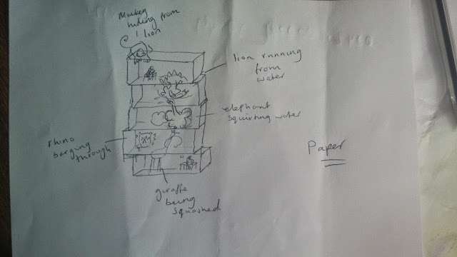
Rewind back to the 2D paper in the boxes


This design will be simplistic, like my card board experiments. It isn't going to be a big 3D sculpture. I am not a 3D artist however I wanted to push the boat out for the exhibition. I am thinking of my audience and how I want them to engage in something more than just a book of watercolours. Although it is going to be a sculpture, nothing about it will be very much 3D. The animals are going to be cut out of lined paper; lined because that is what the character Daisy is writing her wishes on. Amongst puffs of thought-clouds each animal will placed, each on higher than the other going through the box floors. There will be no colour as these animals have come from a black and white written letter. This will complement the watercolours in the book, Daisy's Giraffe, which will be alongside the boxes. The book will have the original poetry and illustrations in it which will narrate and explain the boxes.


Joel Henriques
Invisible string will be used to hold my drawings up but will not be noticed which will make it look like they aren't being supported by anything.
My drawings will be simple like this, the black ink contrasts massively against the white and I like that.

3D just isn't my thing

During the making of the frame I was feeling confident, I really though this was going to work. Then when applying the Fimo I realised it's as if I physically can't create the image I have in my head. This is frustrating for me as I have now practiced with Modroc, plasticine and modelling clay. Perhaps I can still have them in the exhibition? Just smaller versions that passerby's can pick up and interact with alongside the book? Or maybe I should go back to the 2D idea with the paper cut outs standing up, I know I enjoyed that.

Nick Park
This is the kind of design I had in my head, such a strong image I had however it just isn't in my skill to create such things but it was still fun and gave me further ideas.

12 hour drying modelling clay disaster

I am not a 3D artist however I want to create a 3D piece for the exhibition to compliment my illustrations in the book which will be places alongside it. I didn't like the modelling clay. It was messy and I admit to rushing it thinking it would be easy. I need to purchase some Fimo as the results would be so much better and so much more like what I have in mind.

Thinking about scale

I've just purchased 5 packs of Fimo. 3 yellow blocks, a light brown block and a dark brown block. My first step will be creating the giraffe successfully. In total just 5 packs of Fimo cost me £10 so I can't afford to make a mistake. After experimenting with the modelling clay, I know I need to focus a lot more on the structuring of the model rather than moulding the clay straight away. I have begun to think about the scale of my boxes, have I done them too big? One block of Fimo itself looks just about big enough to complete one leg of my giraffe!
My idea is to create a frame first with newspaper like I did with the Modroc. I have bought some building straws that will help serve as a sort of scaffolding. By doing this I save myself a lot of Fimo as I will only need to wrap it round the paper and mould it into shape with more detail. I have an image in my head of how my final outcome will look and I need it to be that.

Pages